
Does design of cart improve conversion?
Does cart design really impact conversion on e-com websites? We'll discuss pros and cons of carts, best practices and what's available on Shopify

I was doing a website audit for a merchant, Captain Zack a couple of days back. They were wondering why their conversion is dipping/low, even when the website is “pretty” and well received. And that’s when I landed on the cart design concern.
More than half of your customers drop-off during add to cart and checkout process. And hence any activity that aims to reduce this drop-off makes total sense. If someone has added to cart, then there must be some intent to purchase. So the flow must be designed keeping the customer in mind. Why would they have dropped-off?
Let’s try and visualise the flow.
Every time a user adds something to cart, they want a confirmation that the product got added to cart. How can we achieve that?
Here are some possible options:
1) A pop-up in the middle of the screen letting you know the product got added to cart
2) Say a text animation that displays the word ‘added’ to confirm every-time a product gets added to your cart
3) You may even choose to display the cart pop-up, showing all the added products prompting the user to checkout
After the product is added by the customer, should they continue to stay on their page, or be taken to the cart summary page?
It completely depends on your business strategy. It will be a combination of Average transaction value & Average no. of products per transaction.
Lets say your store sells groceries, how frustrating will it be to see a side-cart pop-up every time you add a product checking if you want to continue shopping. On the other hand, if you’re selling luxury watches, the customer is more likely to checkout with a SINGLE product.
Pop-up carts
Pop-up carts let you review the cart without having to leave the product page. In the example below, see how the cart only pops up in the corner of the page and doesn’t disrupt the rest of the user experience. Make sure it remains open till the user performs an action to close it.
Pros: These pop-ups take less time to load, give the option for users to go directly to checkout without needing to go to the cart summary page.
Cons: Can feel like a disruption if it takes up too much of screen space.
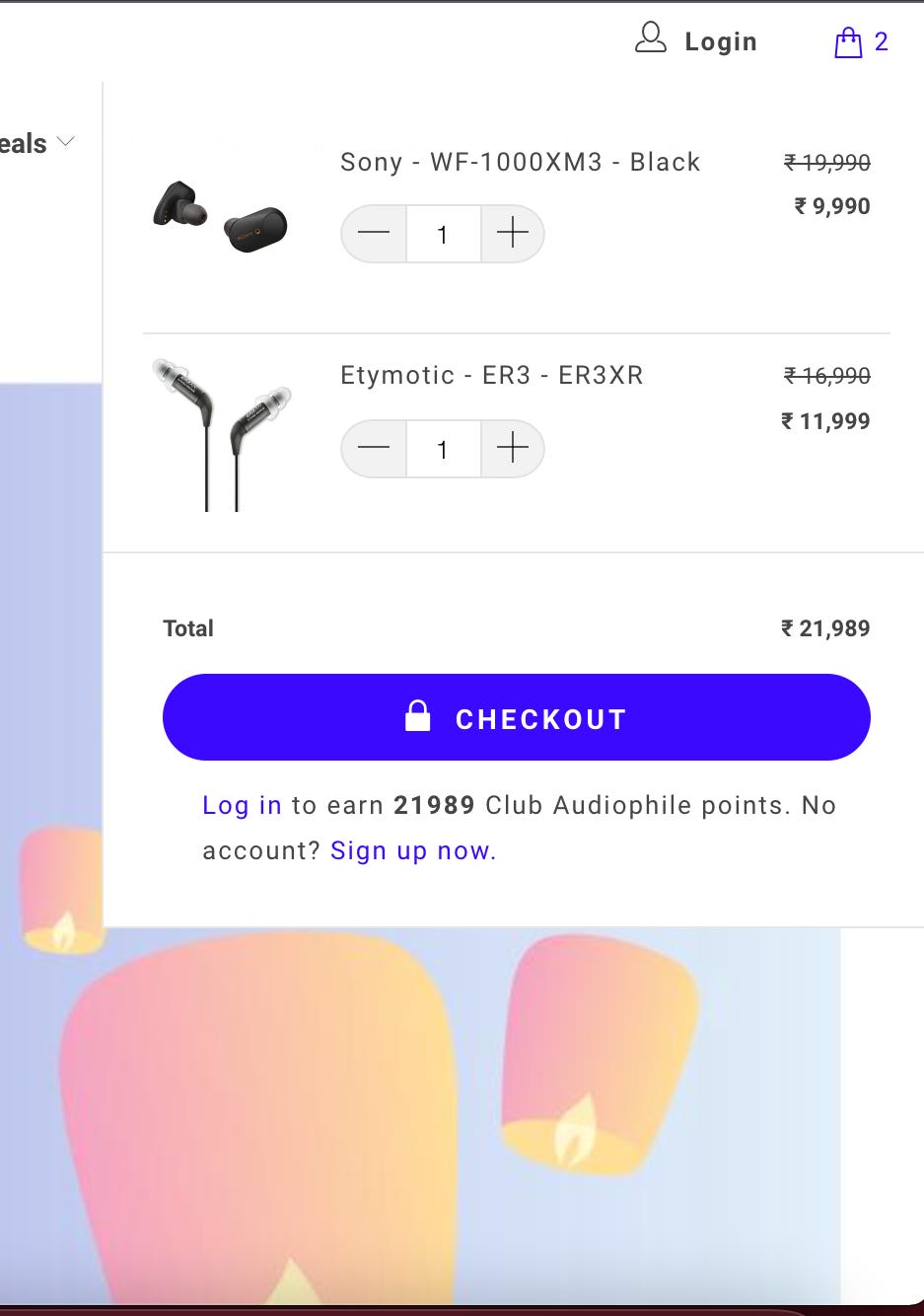
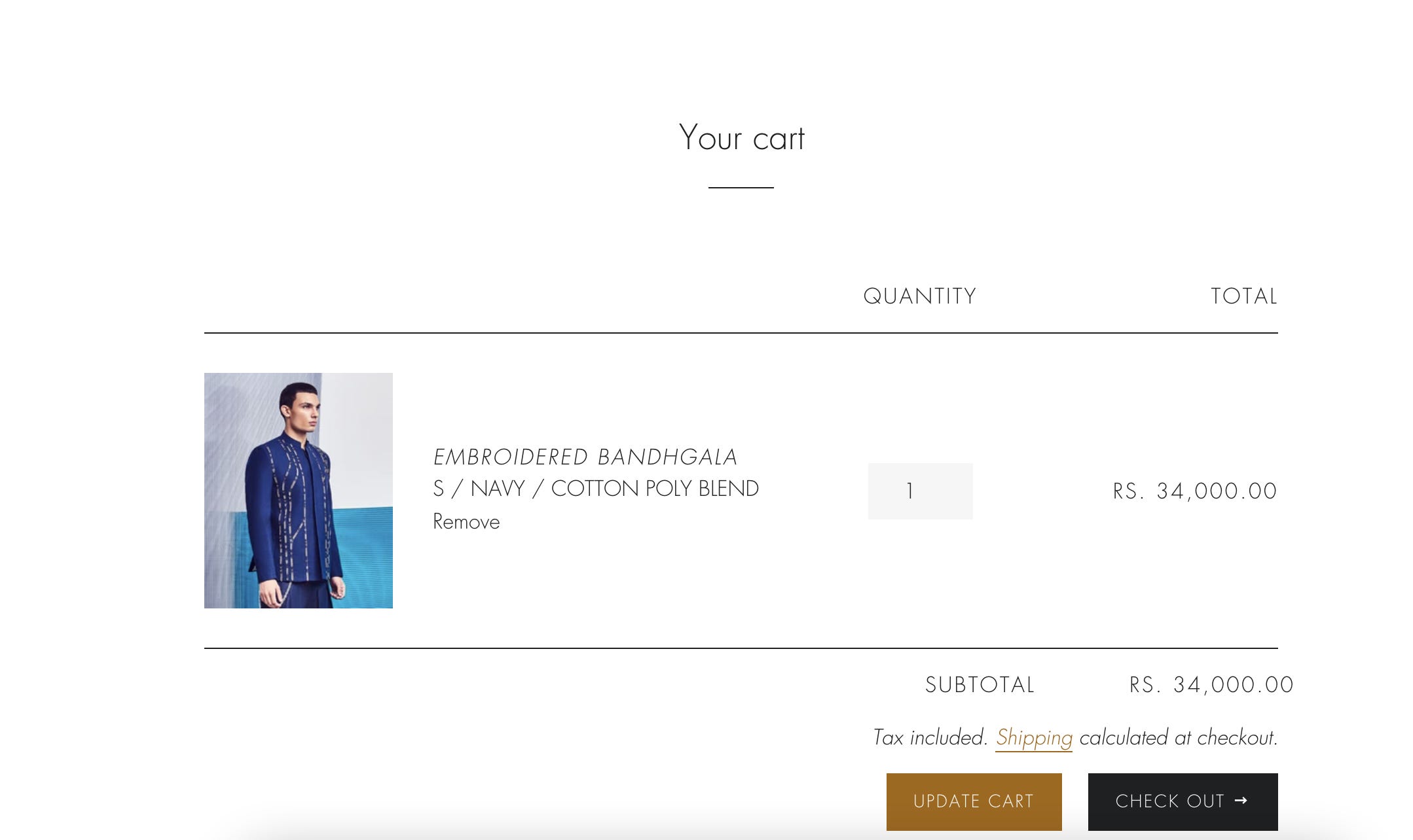
Cart summary pages
Cart summary page shows all the products in the cart in one full-screen view. Some websites take you directly to the cart summary page once you add a product to cart. On the website lineoutline.in, the user is taken to cart summary, every time. a product is added to cart. It works well for them since they sell haute couture ;chances are that a customer may not buy more than one garment at once.
Pros: takes the user closer to checkout; one may display USPs, add on products (upsell) etc on the page to make it more interactive.
Cons: doesn’t make it easy for customer to go back and purchase other products from the website.
slide carts
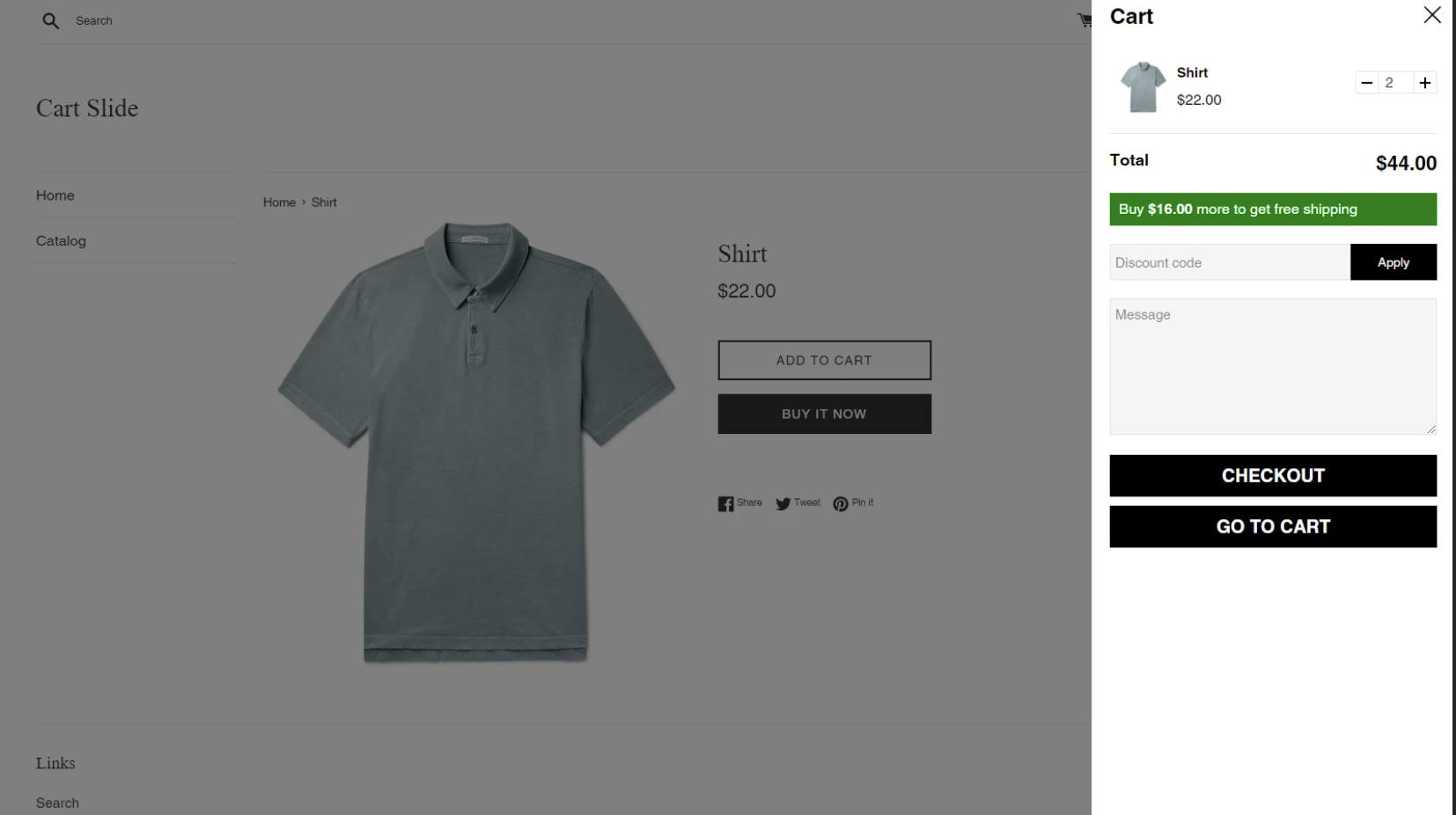
Slide-out carts or drawer carts are an in-between. They have all the functionalities of the cart page and see a full-view of whats in the cart, while letting the user continue to be on the product page.
You are taking them to cart, hence they’re one step closer to payment. They are great for displaying add-on products that the customer might want to add on cart, thus helping increase average order value.They are also a great way to display additional information and USPs to the customer on the side pane- just giving them more reasons to click that CHECKOUT button. But be mindful of the slide-out cart showing up each time you add product.
Case in point: Captain Zack
Captain Zack is like a big-basket for pet products. They’re currently using a theme from the Shopify theme forest called Gecko that has this in-built cart drawer. The cart slides out every time a product is added to cart and requires the user to click on “X” before they can perform any action.
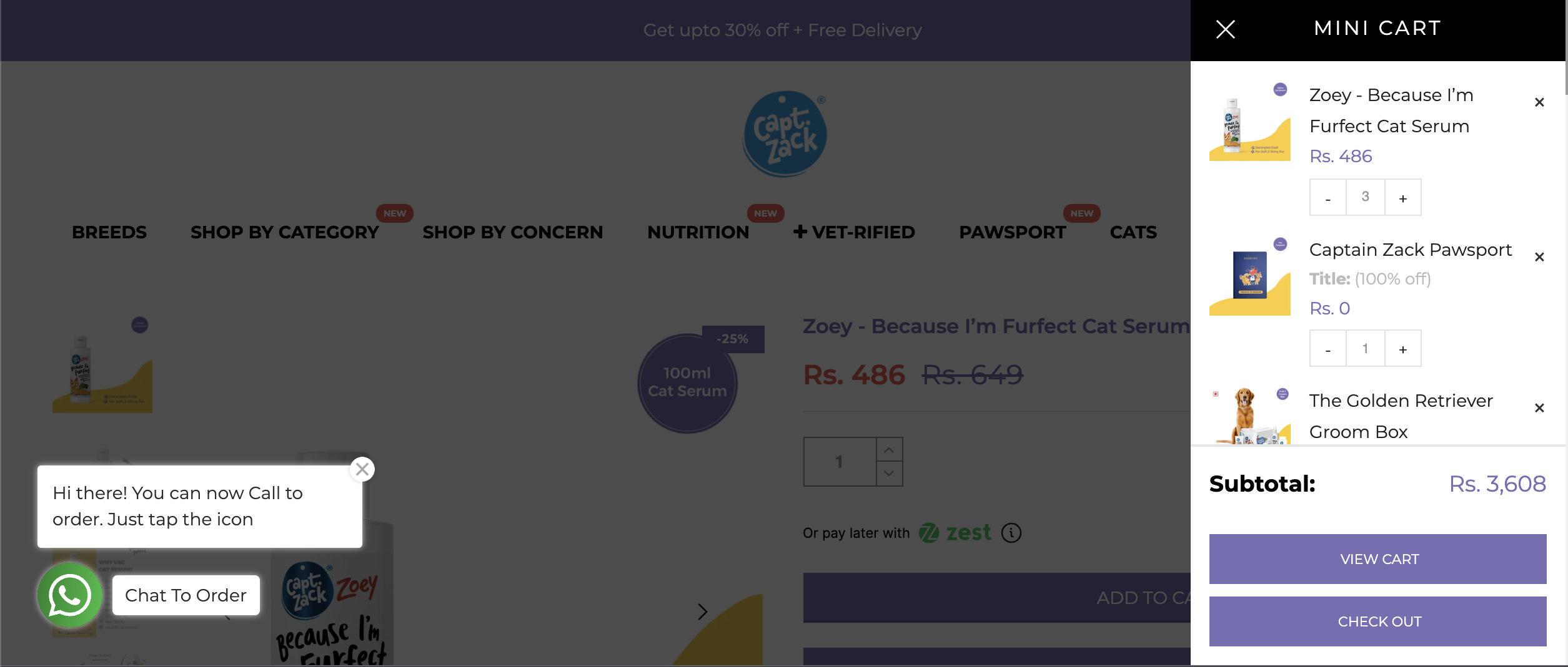
Analysis
Every time a product is added to cart the slide cart slides out, which has to be closed before the customer can browse the rest of the website
The view cart button makes no sense, because well, I am viewing the cart already
If they’d like users to continue shopping, it would be best to prompt them with a CTA on the slide cart
Since the products are discounted, it will be good to show strike-through price (MRP) & the selling price. So that the customer can see the store-wide offer is applied.
According to me, a cart pop-out would possibly make most sense and reduce the friction of shopping on their website overall
All articles on the newsletter are free, so why not subscribe, if you’ve come this far
Some Carts that I personally like:
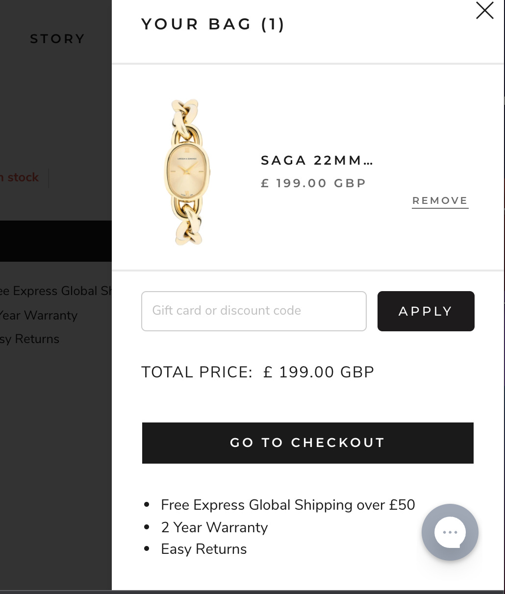
This is the shopping cart of a website that sells watches. Their strategy possibly is to get the user to add what they like & checkout. Notice how the only CTA is checkout and they display the USPs like free shipping, 2 year warranty and easy returns
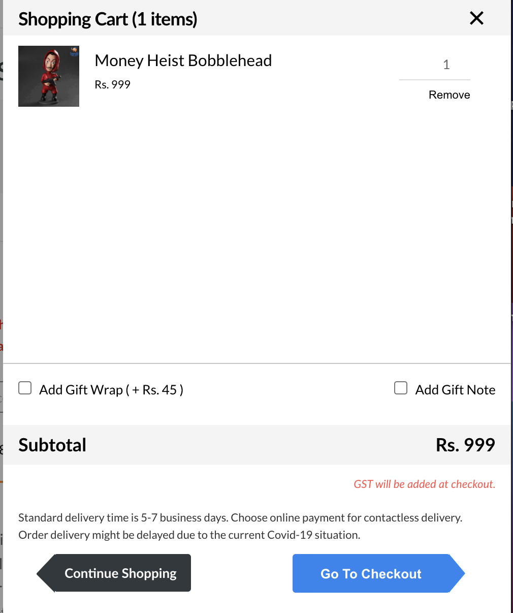
Another side cart that I like from a usability standpoint is on bigsmall.in. Being a gifting website they expect the users to browse, possibly add more than one products to cart. They’ve added the gift-wrapping option, as well as highlighted shipping information
How do I get the slide to cart for my website on Shopify ?
There are plenty of themes on the Shopify theme store that may have a slide-out carts or pop-out carts built into the theme. Alternately there are plenty of apps of the Shopify app store and external web developers who can custom code it for you. In my experience pre-built with theme ones usually are better optimised for speed and load time. Hence be VERY mindful whether the slide cart app is adding to your experience or taking away. A great proxy as usual would be app store ratings/ checking with the Shopify community et al.
To summarise
Evaluate for your business whether slide cart makes sense for you based on your strategy. Key metrics are : Average transaction value & Average no of items per order
Test whether it makes sense to stay on the product page through a pop-up or if it makes sense to take the customer to the cart page
Evaluate what CTAs make sense (only checkout or also continue shopping)
You can highlight USPs like free shipping or display text box for additional info; some businesses also add a pin code validator if they only service a certain area
All information should be displayed clearly & leave no room for confusion e.g. whether the site-wide discount has been applied or not
These are my two cents on the side cart! I am no UX expert but hopefully this gives you some food for thought, and will make you glance at the cart twice when you shop on any e-commerce website ;)